
Learning how to choose bathroom tile colors starts with deciding how you want the room to feel before you look at a single swatch. That one decision, spa-like and calm versus bold and dramatic, sets the direction for almost everything that follows. It shapes the tile itself and even the grout line between each piece.
To choose bathroom tile colors well, start with the mood you want, test samples under your bathroom’s actual lighting, and lean neutral for large surfaces while saving bold color for accents. Light tiles make small bathrooms feel bigger, dark tiles add coziness, and grout color can either blend in or add contrast on purpose.
Picking a tile color feels small until it’s locked into your walls or floor for the next decade. This guide walks through the real decisions that matter, lighting, room size, grout, and long-term wear, with input from working interior designers rather than generic rules of thumb. If you’d rather get expert input on your specific space, a full bathroom remodel consultation can help you settle on tile and layout together instead of guessing in isolation.
How to Choose Bathroom Tile Colors, Step by Step
Start with a feeling, not a color. Tennille Joy Burnup, founder of Tennille Joy Interiors, suggests asking yourself a simple question before anything else: do you want the bathroom to feel like a five-star hotel, or something warmer and more grounded? That answer sets the direction for everything that follows.
Once you have a mood in mind, test actual samples in your bathroom, not just under store lighting. Burnup points out that warm overhead bulbs can shift how a cool-toned tile reads, sometimes completely changing the effect you were going for. Hold your sample tiles in the room itself, and check them in the morning, in the afternoon, and at night under your regular bulbs before you commit.
Which Tile Colors Actually Hold Up Over Time
Not every color ages the same way. Brittny Button, founder of Button Atelier, notes that creams, tans, and soft off-whites tend to stay looking fresh far longer than trend-driven choices. She cautions against bold reds, yellows, and terracottas for large surfaces specifically. People tend to tire of them quickly, and darker, more saturated tiles show dirt and wear more visibly over time.
This doesn’t mean bold color is off the table. It just works better in places you can change easily. Think a painted wall, a set of towels, or a small accent strip, rather than a floor or shower tile you’ll be living with for years.
Let Your Bathroom’s Size Guide the Color
Light tile colors, like soft white, pale gray, or cream, tend to make a small bathroom feel more open, since they reflect more light around the room. Dark tile colors, like charcoal, navy, or deep green, do the opposite. They pull the walls in and create a cozier, more intimate feel, which works well in a larger bathroom that has room to spare. This is one of the first things worth discussing during a small bathroom remodel, since tile color choice has an outsized effect in a compact space.
Natural light plays a real role here too. A bathroom that gets strong daylight can usually handle a darker tile without feeling cramped, since the light softens the effect. A bathroom with little or no natural light generally benefits from staying lighter, so the room doesn’t feel dim or closed in.
How to Choose Grout Color for Bathroom Tile
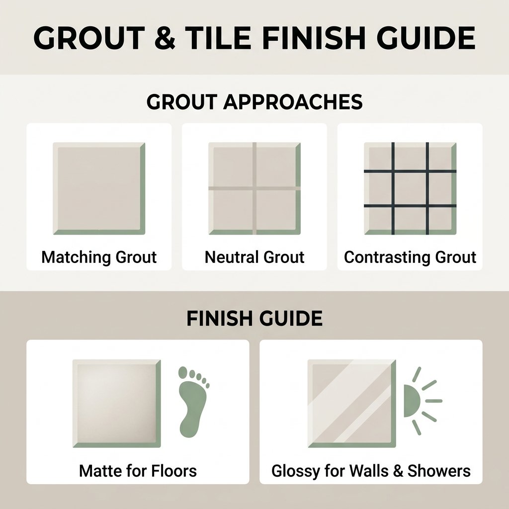
Grout color gets overlooked constantly, but it changes the entire look of a tiled room more than people expect. There are three basic approaches worth knowing.
Matching grout blends into the tile so the surface reads as one continuous material. This works well when the tile itself is patterned or highly textured, since you don’t want the grout lines competing for attention.
Neutral grout sits a shade or two lighter or darker than the tile. It’s a safer middle ground that still adds a bit of depth and definition without turning into a bold design statement.
Contrasting grout stands out on purpose, dark grout with light tile or the reverse, and draws attention directly to the shape and layout of each tile. It looks striking when it’s done well. It also shows imperfections in the tile work more clearly, so it’s worth using a skilled installer if you go this route. A professional tile installation service is worth the extra cost specifically for this reason, since contrasting grout leaves no room for uneven lines.
Practically speaking, darker grout tends to hide staining and everyday grime better over time, which matters in a room that deals with constant moisture. Lighter grout looks clean and soft when it’s new, but it usually needs more regular upkeep to stay that way.
Matching Tile Color to the Rest of the Room
Your tile doesn’t have to match your walls or vanity exactly, but it should feel like it belongs in the same conversation. A simple approach works in almost any bathroom. Pick one “hero” element, the tile, the vanity, or a piece of wallpaper. Then pull one or two supporting colors from it for the rest of the room. This keeps the space feeling intentional instead of like a collection of separate decisions.
If you’re drawn to a bold pattern or a strong color, keep the surrounding materials simple. Neutral countertops, fixtures, and paint give the tile room to be the star, instead of competing with it for attention.
Matte or Glossy: Finish Matters as Much as Color
The same color can look completely different depending on the finish. Glossy tile reflects more light. That can make a color feel brighter and a small bathroom feel more open, but it also shows water spots and soap scum more readily. Matte tile hides daily grime better and reads as a softer, more muted version of the same color. This is part of why designers often reach for matte finishes on bathroom floors specifically, since matte also offers better grip underfoot when wet.
A practical rule comes up again and again in professional guidance. Save glossy or glazed finishes for walls and shower surrounds, where they catch the light and brighten the space. Lean mattes for anything you’ll be standing on.
Popular Tile Colors Worth Considering
Beyond the general rules above, a few specific color families come up again and again in real bathroom projects.
Warm gray and greige split the difference between stark white and full color, adding a little warmth without committing to a bold statement.
Sea glass and soft green bring in color while still feeling calm and spa-like, a popular middle ground for people who want more than plain neutral without going dramatic.
Both work well as either the main tile or as an accent, depending on how bold you’re ready to go. If you’re weighing tile alongside a bigger renovation, a master bathroom remodel is often where these bolder color choices get the most room to shine.
Not sure which direction fits your space? Book a free estimate and get design input alongside a written quote.
Frequently Asked Questions
Should bathroom tile be matte or glossy?
Matte finishes work best for floors since they hide grime and offer better grip when wet. Glossy finishes suit walls and shower surrounds well, where they reflect light and help a color feel brighter.
How do I choose a tile color for a small bathroom?
Light colors, like white, pale gray, or soft cream, tend to make a small bathroom feel more open by reflecting more available light around the room.
Does grout color need to match the tile?
No. Matching grout creates a seamless, blended look, while a contrasting or neutral grout color can add definition and visual interest. The right choice depends on how much you want the grout lines themselves to stand out.
What tile colors make a bathroom look bigger?
Lighter, cooler tones generally make a bathroom feel larger and more open, especially in rooms without much natural light.
Should I choose tile color based on lighting?
Yes. The same tile can look noticeably different under warm bulbs versus daylight, so it’s worth testing samples in your actual bathroom at different times of day before deciding.
What tile colors are timeless versus trendy?
Creams, tans, and soft off-whites tend to hold up well over time. Bold, highly saturated colors like bright red or terracotta can feel dated faster, so many designers recommend saving them for accents rather than full surfaces.